5 Amazing Event Websites (and why they work so well)
When you’re planning to hold an event, creating a strong website is one of the key aspects to attracting the right people and selling more tickets.
People will visit your site to get more information about what you have planned and, if they have a great experience and find your site to be user-friendly, they’ll be far more likely to attend your event and share with others.
In this article, we’re going to take a look at five examples of amazing event websites and why they work so well, so you can get plenty of inspiration when building your own.
1. Coachella helps attendees plan their experience
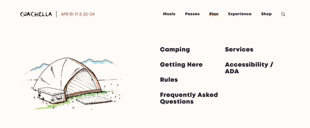 Aim to help attendees plan their visit to your event by providing as much information as possible; about the event, but also activities around the community. Coachella does this well by providing details about everything, including camping, accessibility, the rules that will be in place, and how people can get there.
This is quite important because attending a music festival can be stressful. But, by providing extensive details about everything people might be concerned about (travel, accommodations, parking, etc.), Coachella makes life much easier for the people who are planning to come along.
It takes away the feeling of uncertainty, so people will feel more confident about purchasing a ticket.
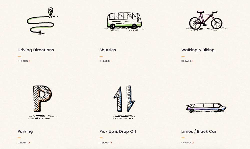 As an event organizer, you need to make sure that you help your prospective attendees out as much as possible by providing them with all of the information they’ll need to plan their visit.
Of course, you’ll want to highlight the date of your event and the location, but it’s also worth outlining transportation and accommodation options, catering information if applicable, and details about the accessibility of your chosen venue.
Beginners will often make the event planning mistake of not including enough information on their website, but doing so will help you sell a lot more tickets.
- Activities around the community
- Accommodations
- Routes and travel tips
- Event details
- Talent details
- Packing essentials and what not to bring
- Whether updates
- Partner with local hotels and excursions to offer discounts to attendees
- Detailed map of community and popular areas
- Map of venue
- Day-of schedule
- Online merchandise
2. E3 builds suspense with content
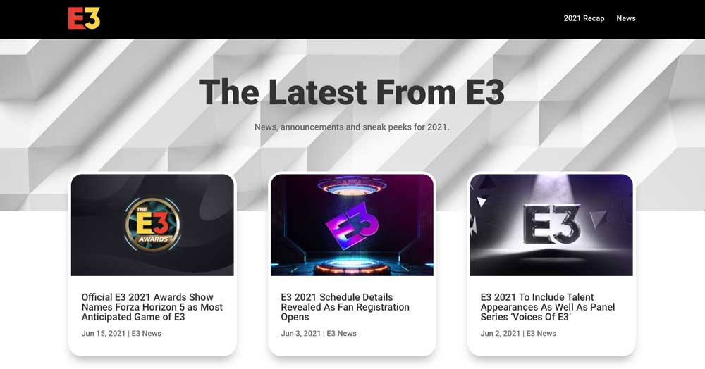
When you’re planning an event, you’ll want to keep prospective attendees updated and in suspense with high-quality content. E3 does this effectively with their website’s news section, where they publish information about the latest developments in their planning process. They share details about brands they’re partnering with, ticketing information, and more.
When building your website, consider replicating this approach. You could publish blog posts about the key speakers that will be presenting at your event, the brands that have decided to partner with you, and updates about your emerging schedule.
Having high-quality content on your website can help attract the right people, build suspense, and make your event more searchable.
Plus, it gives you the chance to mention relevant speakers, use popular keywords, and cover industry topics that will help to boost your SEO.
3. Google I/O anticipates and addresses attendees’ questions
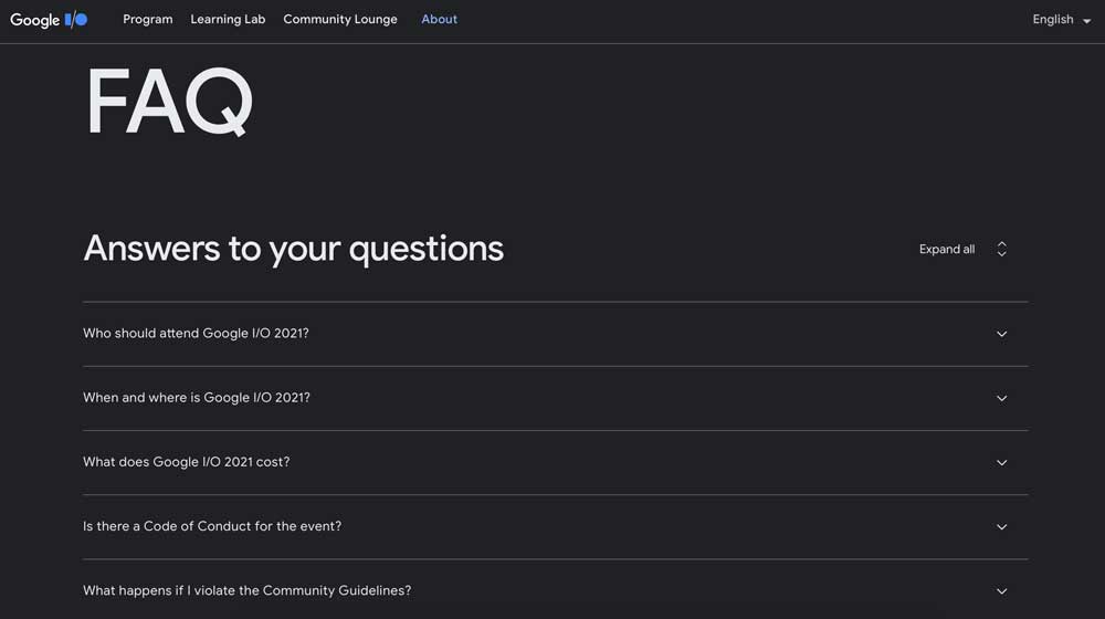
Before buying a ticket for any event, a lot of attendees will have a range of questions they would like the answered. Google I/O remedies this with an extensive FAQ section.
In the lead-up to the event, their team is going to be incredibly busy with the planning process and might not have the time to respond to all of the queries they receive.
So, they’ve anticipated the biggest questions they’re likely to get and covered them all on one big web page. They’ve talked about who the event is for, how much tickets will cost, what the experience will be like for attendees, and more. This is great for helping to move people through the buyer journey and will lead to a lot more ticket sales.
One thing you can learn from their website is the importance of anticipating the needs of your audience. What details would you like to know if you were attending your event?
It could be the price of tickets, the location of your venue, or the number of people who will be in attendance. It’s also a good idea to check your social media mentions or check in with your customer service team to get an idea of what kinds of questions keep coming up. Then add them to your list and answer them on your site.
Common questions might include:
- Refund and cancellation policies
- Dress code
- Location information/venue
- Parking
- What is not allowed into the venue
- Food and drink options inside
- Ticket information (print-at-home, will call, how it works, etc.)
- Times and schedules
- What vendors will be at the event
- Are cameras and photography allowed?
4. Kikk Festival taps into your imagination with impressive imagery
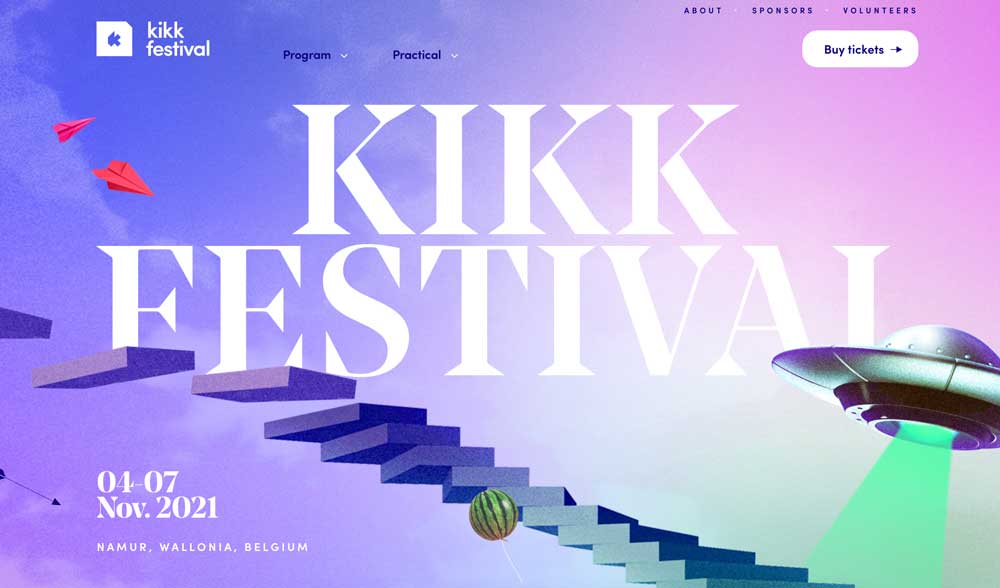
Aim to grab prospective customers’ attention as soon as they land on your event’s website. Kikk Festival achieves this with very impressive imagery and moving parts. They present even the simplest details, such as the number of venues and artists, in such an eye-catching and engaging way that you can’t help but learn more about the event.
You can do the same with your event website by using attention-grabbing elements or animations to pique the interest of your website visitors. Your design doesn’t have to be as complicated as Kikk Festival’s, but it should reflect the style and purpose of your event.
If you’re not sure where to start with this, Venngage has a great guide on effectively communicating with visuals. It covers the best types of imagery to use, and how you can incorporate them into your website for the best results. They also have ready-made templates that can be easily edited and customized for your business.
5. Sundance Film Festival showcases its history
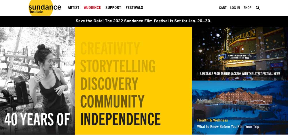 People love a good story, so telling the history of your event can draw more people in and help you to make more sales.
Sundance Film Festival does this well by providing historical details about how their president and founder, Robert Redford, got the inspiration for starting the Sundance Institute. They use old photos of Robert and other people who were integral to the growth of the company to outline activities from pre 1980 to now.
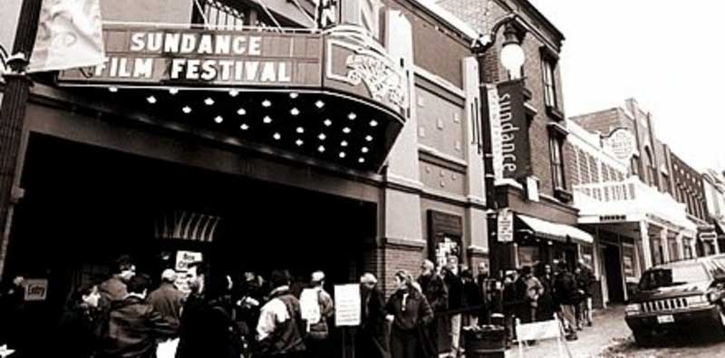 To use a similar tactic for your business, you can also create a timeline that provides information about the history of your business from its inception.
If you would like more advice on how to get the most out of this, RMIT Online has a very helpful guide on the best advertising techniques to thrive in the tech era, and they cover how to tell the story of your brand to make more sales. It’s well worth a read if you’re not sure where to start.
Summary
Building a strong even website is incredibly important if you want to attract the right people and sell plenty of tickets.
And you can do this by:
- Creating content to build suspense
- Anticipating and answering common customer questions
- Using attractive imagery to provide more information about your event.
|
Customized ticketing and registration Build the tickets you want (GA, VIP, packages) |

Author: Alex Ratynski
Alex Ratynski is a Content Strategist at Loganix, an SEO fulfillment partner that works with agencies and marketers. The company focuses on helping businesses to improve their online visibility, so they can grow and reach their goals. If you enjoyed this article, visit the Loganix blog for more expert advice.


