6 Design Elements For User-Friendly Event Websites
We all know what we want from our website, but figuring out how to make that happen is a whole different story. There are a million-and-a-half web design strategies out there.
HubSpot is stuffed with them, and a quick Google search will spit out over a million more results. But, you don’t just want to convert customers into buying a product — you’re selling an experience.
So, how do you create a website that helps you sell experiences (a.k.a event tickets)?
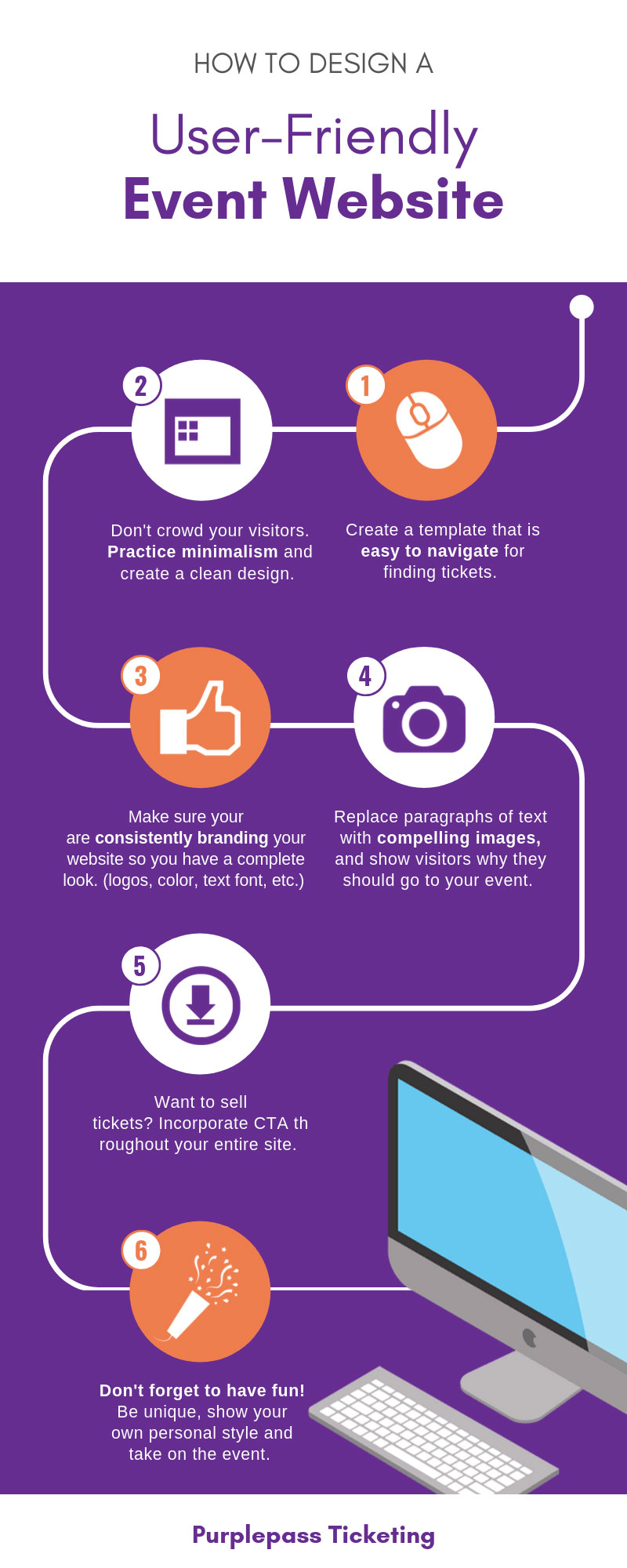
1. Create An Easy Navigation
If people come to your website with a question, your website should answer that question in the easiest, least friction-causing way possible.
We know!
Trying to bring up navigation opens up Pandora’s box.
On the one hand, you definitely should know that it takes users 0.05 seconds to form an opinion of your website and 38% of people will straight up stop engaging with your website if they don’t understand the content layout.
So, navigation is important.
But...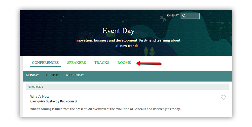
How do you create better navigation?
After all, every person reading this has different event brands, websites, and design taste buds. Navigation is extremely design-oriented.
So, how do we give advice on something that’s going to be unique to each of you?
We’re not. Instead, we will tell you what not to do. There are a million right ways to build nav menus for your awesome, creative event websites.
But, there are like 5 ways you absolutely shouldn’t. So ...
Don’t make them hard to browse
Don’t keep your nav menus cluttered with options; keep it simple and to the point.
Don’t use basic text (i.e., your layout should be more customized than simple Home, About Us, Information, and Blog nav buttons). Tell them exactly what they will be getting.
Don’t put your nav menu somewhere counterintuitive to be unique (mostly just stick to the top)
Don’t try anything too quirky with the nav menu; save that for the rest of the website.
2. Keep It Simple
You’ve probably seen the word minimalism hiding on the covers of white books tucked into the corners of trendy coffee shops.
Or maybe you’ve heard whispers on some podcast or radio station where some person is telling you to sell all of your possessions and move into a van. We’re not talking about that kind of minimalism.
This is all about design.
Minimalist designs involve taking clunky websites and turning them into easy-to-browse, simple websites. To give you a clear-cut example, you want this.... not this. Or the design below is a great example of an open, non-cluttering space. 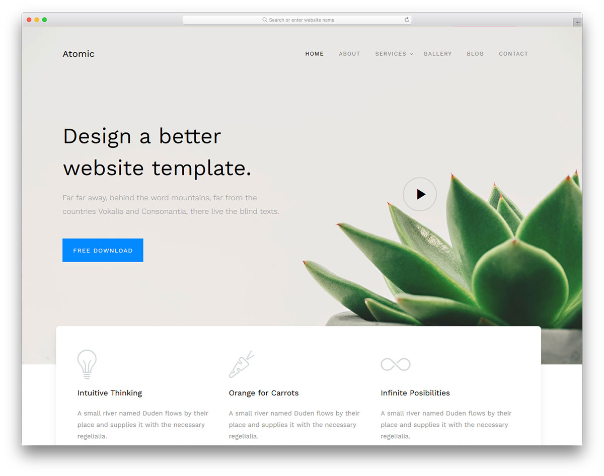
Not only do minimalist designs make your entire website easier to browse, but it helps reduce load times — something that’s extremely important to customers.
In fact, 47% of customers expect your site to load in less than 2 seconds.
Websites that take just a little (we’re talking seconds here) too much time to load cost businesses BILLIONS in lost revenue yearly.
Minimalism also sells tickets.
94% of peoples’ first impressions are directly related to the design of your website. Keep that design professional, clean, and simple.
Note: This is a breakable rule. But you really need to know what you’re doing. In the current design ecosystem, pulling of minimalist web design isn’t difficult.
Drag-and-drop web design and the majority of web templates are minimalist-oriented. But, you can definitely go the opposite route and pull it off. Check out the strange 1990’s site design for Brand New Conference. It works. And it’s definitely not minimalist.
3. Brand Everything
Remember A.B.B. Always. Be. Branding. Seriously! Walker predicts that brands will overtake price and product as the key differentiator between brands by next year.
And consistent branding across all channels (think: event, social media, and website) increases sales by 23%. There’s a reason that almost 90% of marketers say branding is their #1 goal; it’s a big deal.
When it comes to your website, branding should influence your color palette, typography, and overall design-build.
Is your brand colorful, playful, and quirky?
Then show it!
This is the part where you can break that minimalism rule (note: you should still carry over the core concepts of minimalism; your weird colorful site should still load quickly).
Always keep branding front-of-mind during your design process.
4. Use Images
Did you know that it only takes 13 milliseconds for your brain to process an image? That’s 60,000x faster than it processes text.
And that matters.
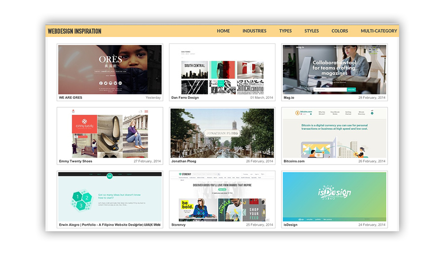
95% of people say they want content that’s shorter and more visually oriented. In other words, put more images up on your website. Graphics, infographics, videos, media galleries, etc.
Seriously!
It can completely change the way users interact with your website and consume your content.
And this isn’t only websites. Posts with images on Facebook get 650% higher engagement! And they also get 150% more retweets on Twitter.
5. Big Bold CTAs
CTAs are the #1 most important way to sell your tickets.
They’re the finish line. You spend marketing dollars building your dream car, and sales time getting it to the finish line.
But... what happens if you forget the finish line? Over 70% of small businesses (that includes event planners!) forget to put CTAs on their homepage.
Seventy... percent... that’s far too high. Let’s keep this simple. Put big, bold call-to-action buttons on your homepage. Want to know how to make them?
Click here. Or on the CTA above!
6. Keep it Fun
See all of those rules above? You can break them... all of them... if you have to. This is your website at the end of the day. It should reflect YOUR brand.
Don’t make a cookie-cutter website based on a list.
Try to have some fun with it!! We heavily recommend ALL of the tips above, but be the bull in the china shop if it means that you create something you can be proud of and that represents your event best!
You got this!!


