Click Here If You Want To DOMINATE Your CTAs
Selling tickets to your event is all about attention. Everyone wants consumer attention.
Between the 60 million businesses on Facebook and the flocks of apps and movies vying for a moment of everyone’s time, the average person sees over 5,000 ads every single day.
So, how in the world do you get people to stop and listen to yours?
How do you convert consumers into attendees in a crowded market? Most marketers use an attention-catching tool called a call-to-action buttons. Here’s how they work.
|
Purplepass For Volunteers Not just for events! Use Purplepass for volunteer management, create campaigns, sign up pages and it's free! |
What are CTAs (call-to-action)?
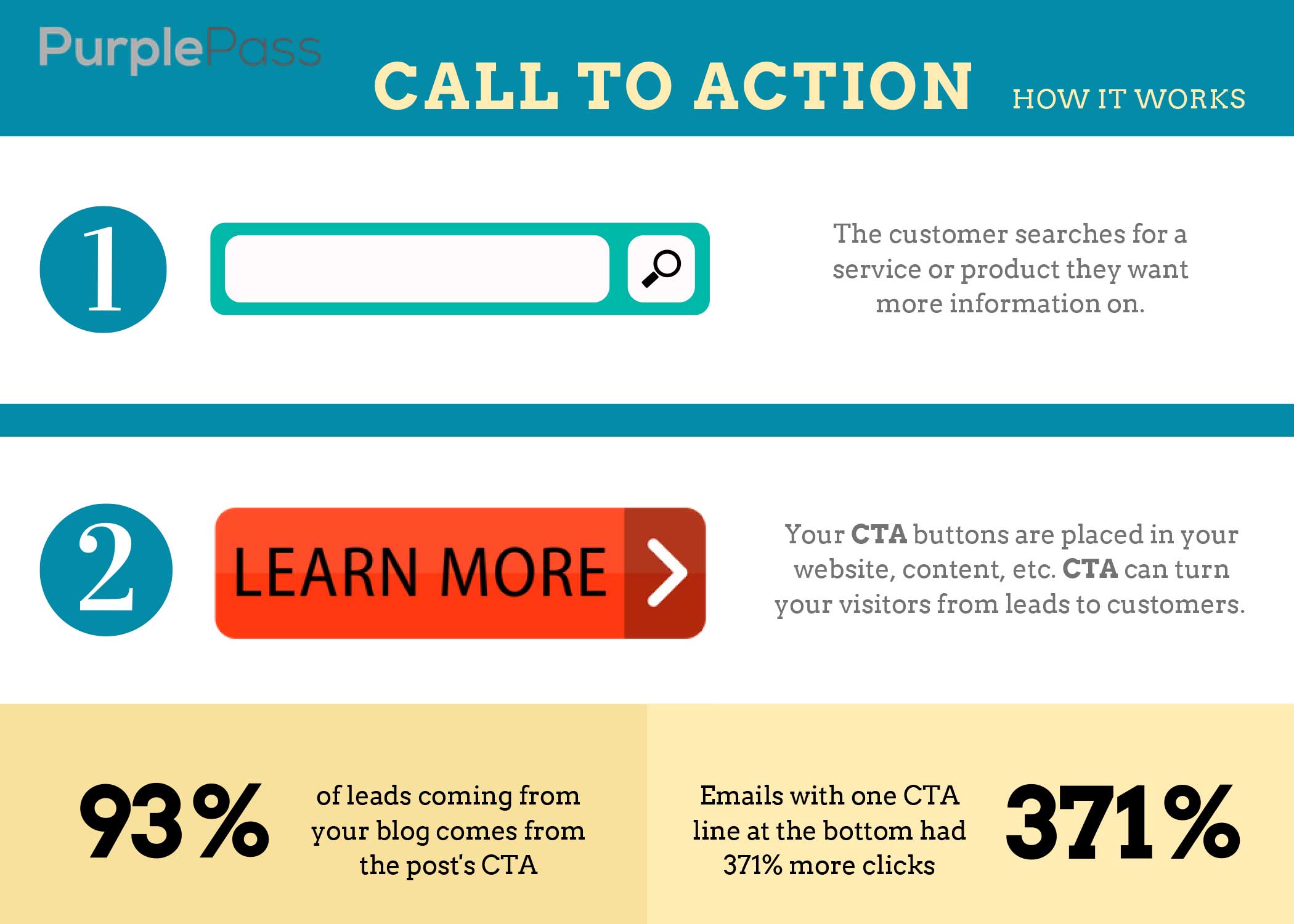
A Call-to-Action (or CTA) is an image, video, or line-of-text that grabs users' attention and converts them into customers.
You see these everywhere. Every ad that has a clickable button that says “Buy Now” “Learn More” is a CTA.
All of those “Contact us today!” lines at the bottom of blog posts are also CTAs. And these CTAs can single-handedly drive your sales in a positive direction. How in the world is a simple line-of-text supposed to help me catch peoples’ attention?

Here are some statistics:
- Emails with one CTA line at the bottom had 371% more clicks and 1,600% more sales
- Facebook pages with one CTA line have 285% higher click-through-rates
-
83% to 93% of leads coming from your blog comes from the post’s CTA
So, to summarize — CTAs are a big deal. But, knowing what CTAs are and knowing how to use them are two wildly different things. Let’s take a look at the latter.
How do you use them?
There are a few ways to create and utilize CTAs. There are two main types of CTAs that you’ll use for your events
-
Button CTAs: These are graphic-based CTAs. They’re either giant buttons or banners that will display some text and are clickable.
You’ll typically see these on landing pages or blogs. Creating them isn’t necessarily difficult, but you will need Photoshop or some other editor and design experience.
Or, you can just download free ones online. HubSpot has a great selection of free ones. And there are a few companies that offer software solutions that spit CTAs (see example below) out at the speed-of-light.

f -
Text-based CTAs: These are CTAs that are typed out. You’ll see these at the bottom of blog posts and in social media profiles. You don’t need any experience with design to nail these CTAs.
A very basic example would be “Are you ready to sell more tickets? Contact us at Purplepass to learn more!”
And these can get way more attention-grabbing (e.g., “STOP! How many tickets have you sold today? If your answer is anything other than every single one, click here!”) Try to match the tone of these with the type of content you’re producing.
Those two CTA types can each score you tons of leads and boost your ticket sales. You just have to know where to put them.
The secret to CTA placement is that it has to be natural.
You can either stick it throughout emails and blog posts.
Or, find a way to naturally incorporate it into the text and content. Either way, it shouldn’t look out-of-place. Button CTAs should be placed in natural spots on your websites and landing pages.
You want them to stick out. But, you don’t want them to come across as overly “salesy.”
CTA copy that sells tickets
We won’t get into the design elements of effective CTAs. That’s a little outside of the scope for this post.
But, let’s talk about what kind of copy grab people’s attention.
-
Tell users what action they’re taking. When a user clicks on your CTA, let them know what will happen. So, instead of saying “click here to buy,” say “Secure My Ticket!”. It should be a very direct line telling your readers exactly what to do.
-
Use FOMO. Fear of Missing Out (or FOMO) plays on users natural anxiety. No one wants to miss out on something amazing.
Put a clock at the top of the page or show the people how many tickets you’ve already sold. Using phrases like “Click here to reserve yours!” or “Reserve Mine Before They Run Out!” work well for FOMO campaigns.
- Show them value. Any time you’re trying to sell someone a ticket, you want to show them the value of that ticket. CTA copy like “I’m Ready to Experience the Future” or “Did You Say Party? I’m In!” lets the user know what kind of value to expect from the event.
- Provoke emotion. Instead of saying “book your ticket,” think about saying, “Experience the event of your dreams!”. You want to convey strong emotions like enthusiasm.
- Use numbers. Give your prospects a reason to click beyond your words. Something like “96% of Brands Feel Unprepared for IoT. Join Us At The IoT Summit To Be In The 4%!”
-
Get a little creative. Every event is different. And the tone that guides your event doesn’t have to be cookie-cutter. If you’re running a laid back event, get a little cynical or humorous.
Take this billboard for an A/C company, for example. Don’t lie, that definitely caught your attention.
Hey! Do You Want to Sell More Tickets?
Of course you do! Click here to request a demo on the software that’s about to change your life! (see... that got your attention).
|
Email integrations and guest lists Upload guest lists using one of |


