How to Make your Business Brochures More Interesting
Brochures are a great marketing tool for businesses of all varieties and sizes.
They allow you to connect with individuals and organizations who may want more detailed information about your company; brochures work similar to business cards, but carry more information.
However, brochures can bore your audience if not presented in a creative way and may not have the desired impact unless you take steps to make them more appealing.
There are several ways to accomplish this, and these 7 ideas will help you create brochures that are eye-catching and relay the information to your audience more effectively.
1. Change the fold style
One of the easiest ways to make a brochure more appealing is to use a different fold style. Step out the the box and try a new shape that breaks traditional brochure looks.
Instead of the standard fold, you can choose an accordion fold or a double parallel fold for example, to add interest. Or you can go one step further; see unique fold ideas below.
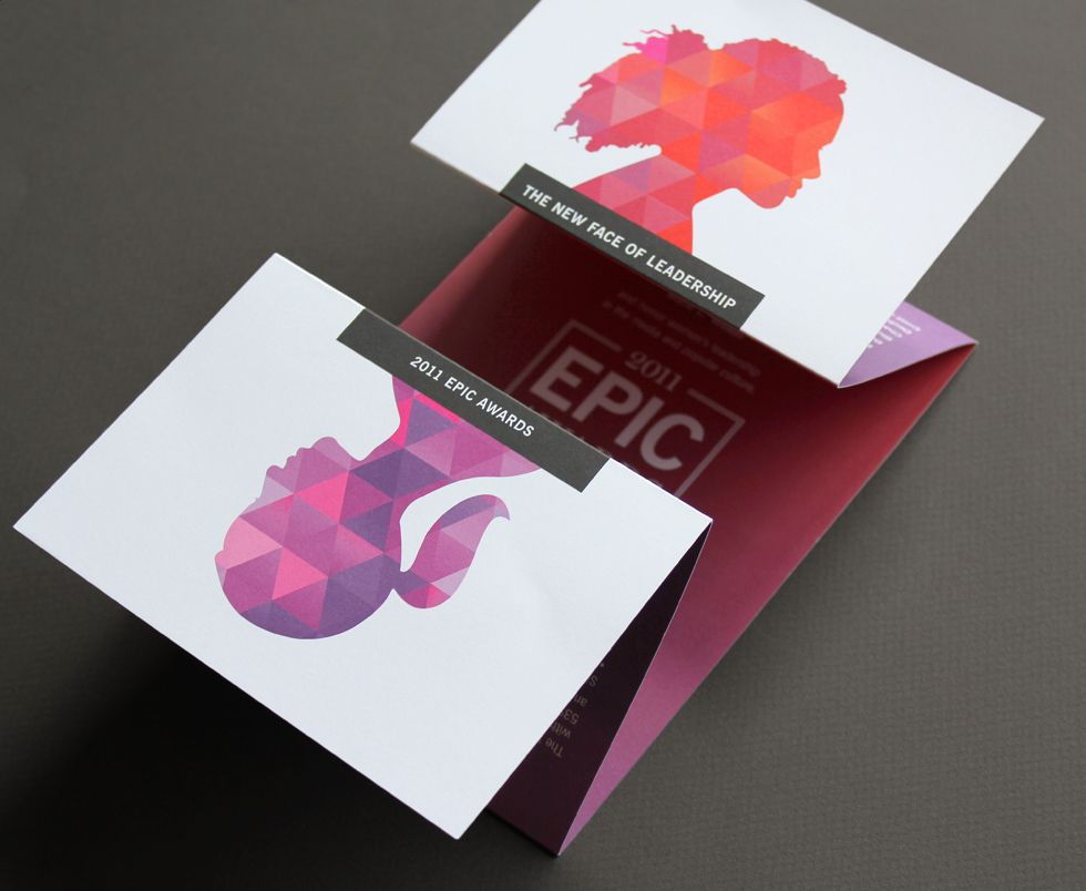
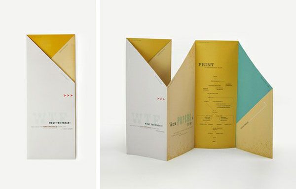
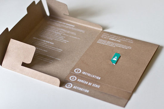
The fold you should choose may be directly related with the amount of information provided and the products or services your company is offering.
If there are multiple options and ideas, choose a more complex fold style to allow plenty of space for bold fonts and photos to help make your information stand out.
2. Focus on pictures
The old saying goes, “A picture is worth a thousand words”, and for a brochure, this rings true. If you can use a picture to convey an idea, feeling, or service, take advantage of the opportunity.
Viewers are more likely to look at a picture and digest the information quickly, as opposed to reading words.
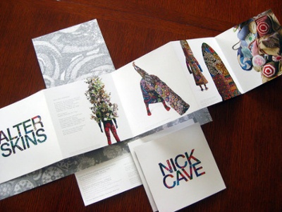
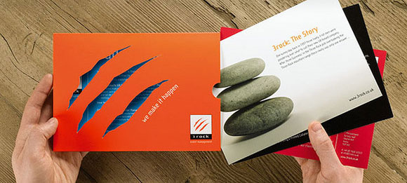
Gabe Arnold, a serial entrepreneur, talks about the power of visual aids, saying "...the human brain can process images up to 60,000 times faster than words. They say that you don’t get a second chance to make a first impression. You actually can get a second chance to make a first impression, but that’s a post for another day. The point is, with a picture, you can convey so much more information than you can with words. In fact, it can take a thousand words just to describe what is in one picture. And, pictures have the ability to convey abstract and complex concepts, such as facial expressions.”
If possible, try to have your photos support your written content to make your presentation more memorable and relatable. See some examples of clever use of imagery below.
3. Consider shapes and backgrounds
When you are revamping or creating a brochure, be creative by playing with shapes and backgrounds. Don’t be scared to use unusual shapes for illustrations, photographs, graphics and colorful or unique backgrounds complimentary to the content.
Color Psychology could play a substantial role here when designing your theme colors and brand concept. Color Psychology is the idea that colors and different hues determine a human’s behavior or how they feel.
Color influences our perceptions that are not obvious to us, such as the taste of food or an emotion; similar to the placebo effect.
For example, if you are a health brand, what color do you usually use on your material? Green! Green makes us think of healthy foods, activity, recycling. So what emotion do you want your brand material to draw from your audience? You can use color to make them feel exactly what you want them to feel.
4. Create an eye-catching cover
Ah, yes the cover, is it going to be basic or is it going to make me stop and want to read it because it’s unlike anything I’ve ever seen before!?
The first thing people notice about your brochure is the cover, which is why it is important to make a great first impression. Having a unique cover can be anything from the title or word choice, the font choice and size, the shape or colors.
Determine what you are trying to promote, what you want this brochure to say, and what first impression you want to draw from your audience.
5. Be bold with quotes and facts
What do you want your readers to see or pay attention too? Ask that question and make that content bold!
Place it in a way it cannot go unnoticed.
Use a bold font and design for all of your quotes and facts when creating a brochure. Bold fonts will naturally attract the eye of your readers and help them digest the important facts and ideas you are trying to present. It will also help break up content and make it easier to digest and scan all the material.
6. Pay attention to design elements
When choosing your aesthetic, all your design elements should work together in harmony not against one another.
Doing so builds a more attractive, appealing layout, can catch someone’s eye, while conveying all your information. Make something easy on the eye and have working parts.
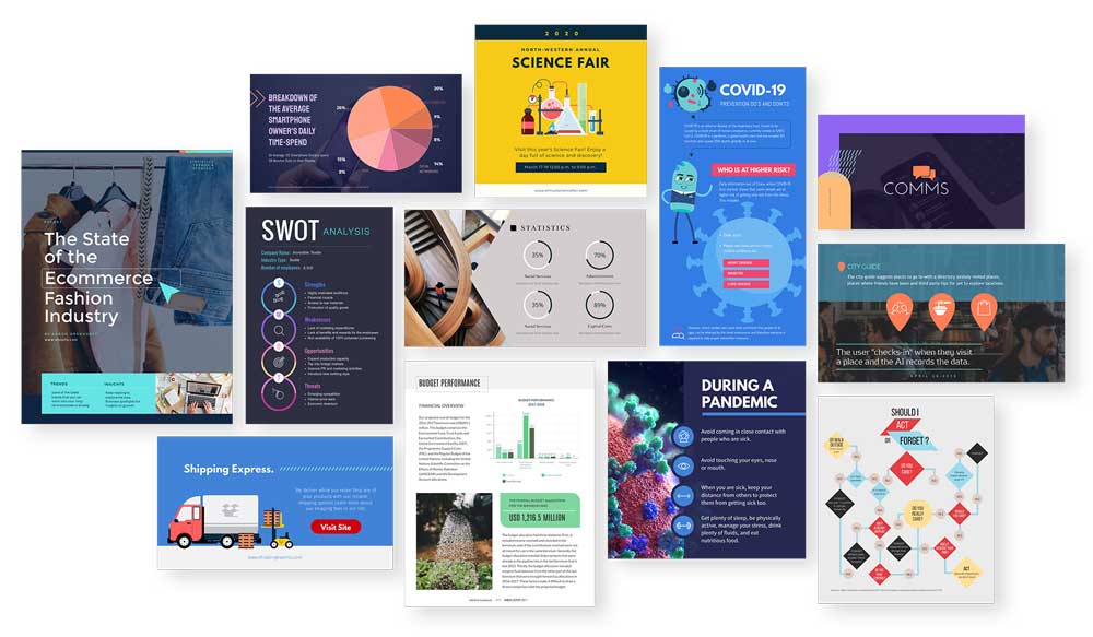
Hopefully, we can all agree that the picture on the right uses its design elements to work together and unifies the brand. The fold design, images, font, consistent colors all make a beautiful aesthetic that is easy to look at, and you know right away what the brochure is about.
The brochure on the left is a little plain. In my opinion, the design elements work more against each other than they do as a unified brand. The colors are all different and from just looking at the image you are still left confused as to what their product or services are.
Everyone has their own opinion and might disagree with the approval statement, which is fine. However, I hope you can understand based of those two brochures how important it can be to have all your design elements consistent with one another to appeal to a reader.
7. Try using 3D and interactive elements
I bet most brochures you’ve viewed didn't include a pop-up or interactive parts.
So just because that isn‘t the social norm does that mean you can’t do it?
Go beyond the boundaries and include something interactive for your readers to hold their engagement longer. Some engaging elements could be:
- Scratch and sniffs
- Pop-ups
- Stickers
- Removable items
- 3D elements
Including these elements gives your brochure contrast and makes it more memorable to its audience. It can also help highlight a specific theme or ideas important to your company.
Don’t settle for a boring, average brochure. Make your company stand out using these great ideas! To help get you started, try Venngage free brochure maker and create an engaging and informative brochure in minutes!
If you are interested in creating your own marketing material such as event signage and brochures you can check out Express Event Printing below.
Express Event Printing can bring your marketing concepts to life and help design coordinators make their ideas become a reality.
|
Fast event printing you can count on Create custom prints, ticket stock, and |


