4 Proven Ways to Decrease Your Website Bounce Rate
Most industries rely on a heavy internet presence mainly because most customers today turn to the internet to research or do comparison shopping before purchasing anything.
One key to having a successful presence and engagement is to reduce your website's bounce rate, or the number of people who log on to a website for a short period and then navigate away.
The longer the viewer spends on the company site, the chances increase that they will interact with the brand, become a lead and eventually turn into a customer.
So how can you easily decrease your bounce rate?
1. Perfect your call-to-actions (CTA)
Don’t hesitate to add an appealing call to action and provide relevant offers up front and above the fold (before they start needing to scroll down to view more).
Prominently feature your CTA where viewers can immediately notice and take them into consideration.
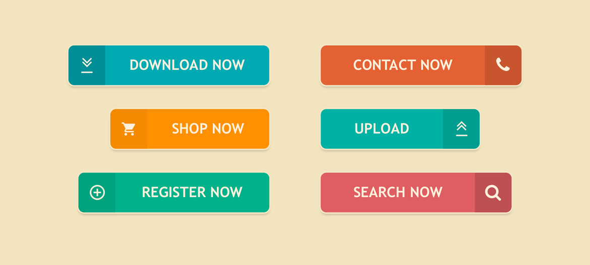
A Call-To-Action (CTA) is just as it sounds; it’s encouraging your guests to do something, hence calling them to that action.
For example, one CTA could be “Call Now”, this implies that the reader should call now right? So you would put this right next to or under brief copy on your product or services and for more information they can click that button to “Call Now”.

The point of a CTA is to directly tell your audience what you want them to do, give them a sense of direction and hopefully they will follow.
Make an effort to create a CTA that sounds necessary or highly beneficial to your target audience. This will encourage them to at least browse the website for additional information.
One trick is to avoid sounding too pushy while not hesitating to encourage the viewer to learn more about offerings from the website or to ask questions via the contact tab on the website.
Here are some common CTA words, verbiage used in content marketing:
- Click
- Click Here
- Subscribe Below
- Free Demo
- Request a call
- Read More
- Learn More
- Call Now
- Contact Support
- Download Now
- Free eBook
A/B testing is a great way to find the best CTA phrase, color, design etc. that works for your market place.
2. Optimize keywords and their usage
Using keywords to attract traffic and optimize content on the internet is a time-homered practice that is still extremely useful today.
Although relying solely on keywords isn’t a solution, it is still a way to boost your traffic across the internet and can help you get your company’s name in front of non-organic traffic and boost page rankings.
Not only does using the key terms your audience is looking for help build your SEO, but it’s going grab their attention because it's addressing topics they are interested in.
|
Stats, sales and marketing reports Find a report that works for your event with Purplepass. Use our reports or build your own such as marketing, financial or event statements. |
Keywords work best when they fit naturally into a sentence and add to the content rather than existing solely to show up on a query or have a higher page rank.
When keywords are used inefficiently, the viewer will feel like the brand is not authentic and assume the website is too sales-focused.
Remember, you are here to solely solve your customers' problems and act as a resource for them, so make that point quickly and clearly.
Address their problems first and right away so they remain interested and then solve them; this way you can keep them on your page longer and decrease your overall bounce rate.
Answer these questions to help identify what type of words, phrases and copy you should be putting front and center on your page to reduce your bounce rate:
What problems are my customers looking to solve?
How can I solve them?
What resources can I offer that would benefit them?
How can I make their lives easier?
3. Update the look and format of the website
If your website appears outdated or boring, people may immediately lose interest. You want to grab the viewer’s attention as soon as they load your page.
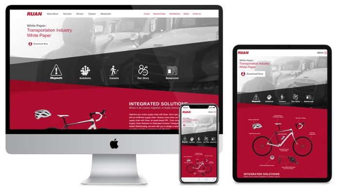
To accomplish this, you must use an updated theme with eye-catching graphics, picture, and easy-to-read fonts.
The entire design needs to be aesthetically pleasing while staying in tune with your brand.
Telepathy put together a great article that shows the top 30 bold and clean web designs for getting inspiration that might help you on your hunt for ideas.

When creating your vision board or mockup for the website design, answer the following questions:
- What are your goals? Establish exactly why you are making the site and what you want it to accomplish. Which brings us to the next question.
- What is the purpose of your site?
- What is your buyer’s journey? Understand what your buyers goals are and make their journey to becoming a customer easy and accessible on your website.
- Have you defined your brand's style? The most important part about marketing a brand is staying consistent.
All your marketing materials and content needs to consist of the same style and design so it can become recognizable by your guests.
Fonts, colors, layouts, CTA, images, etc. are all the different design elements that need to work together rather than separate.
- What website layout do you envision? Do you want to be traditional or outside of the box?
Whatever you choose, make sure the following remain consistent as these are the standards for websites and usually what is expectedof your visitors.
1. A website logo in the top left or right corner
2. Contact information in the top and bottom of the website
3. Navigation menu at the top of the screen above the fold
4. CTA at the top of the website
5. A search feature
6. Social media icons in the website header and footer
- What is necessary and unnecessary to have on your site?
Practicing minimalism and getting rid of any copy/content that doesn‘t serve a purpose is key. This helps eliminate any unwanted material, clearing up space and streamlining your design.
When formatting your website, use different elements to break up your copy and make everything easier to read. Including headings are a great way to break up content and set as reading points for your visiters.
That way they can save time and quickly find the topic they are looking for.
This is a similar concept for choosing lists and bullet points over paragraphs.
When readers first see a blob of words, it's hard to break up the reading in their minds, but by creating lists you are dividing content and making it easier to digest.
Remember, never skip out on the visual aids, as visual information is better received than text.
4. Improve load speeds of your website
An immediate cause for a viewer to leave your page is when they are experiencing slow loading speeds. People become frustrated and will leave the site because they give up on waiting for things to load.
To prevent this from happening and to give your website a more professional appearance, invest in services to help you optimize your website's load speed.
One way to check your site speed is by entering your URL at PageSeepdInsights; a site created by Google developers who show you exactly what is creating slow load times and how to fix them.
|
Get weekly marketing advice and planning tips Subscribe below for weekly emails with |
Follow these tips to keep your viewers engaged and to prevent them from navigating away from your website.
If you want to learn more or keep getting new content, you can subscribe to our blog below for weekly tips and marketing advice.


